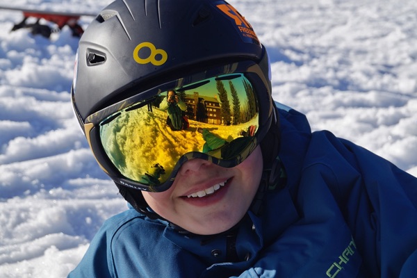
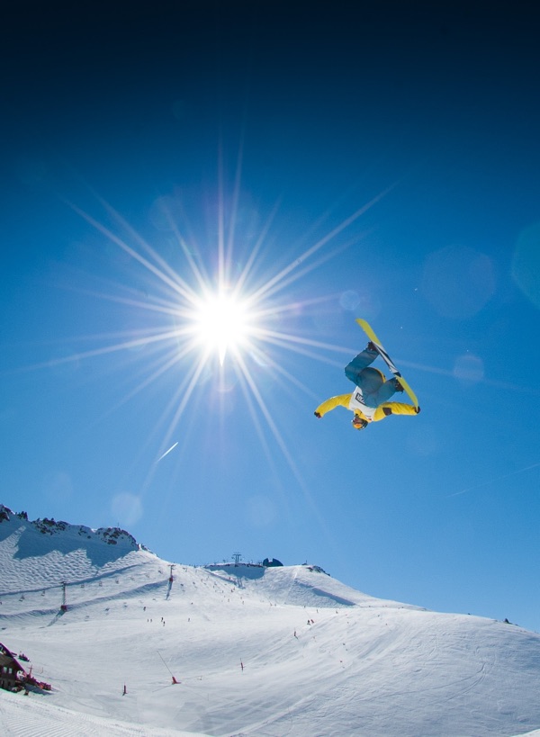
go ski place
Take CSS GRID with you
Some notes here:
Elevation: Hours:
The main grid uses 2 rows on smaller screens. The top uses a container (grid-1) that takes up all screen height. These elements are placed in grid-1.
More notes:
I am using the same grid configuration across all breakpoints: 6 columns and 5 rows. The second row has no content, but fills up the space for different height screens.
Final notes:
These 'content-wrappers' are placed on different columns and rows depending on the viewport width with 'line-based-placement'. So the positions (and sizes) change at breakpoints.
Grid-2 notes:
The setup here is similar to grid-1. Again these content boxes are placed and stretched by positioning them on the grid lines.
This is cool:
The container above the link uses a grid for positioning and lining up the items. To add rows, simply duplicate elements!
Breaking the grid...
A pixel top-margin is used to push the second image down. It could have been done with grid only, but this was faster :)