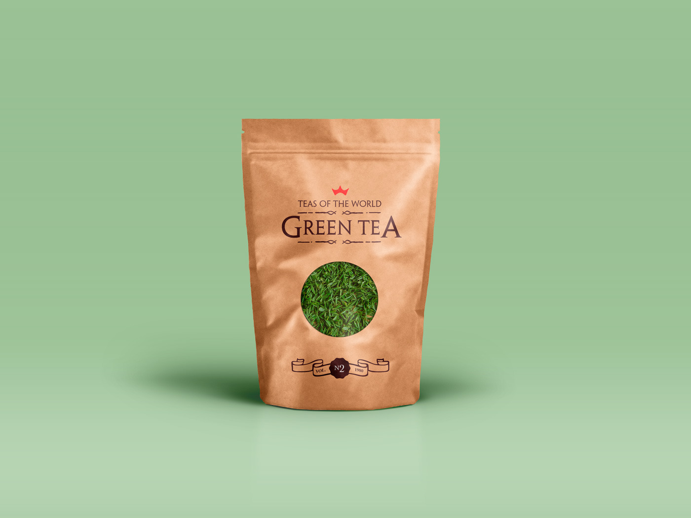
GREEN PREMIUM

Green, $25.50, 4.5oz
The navigation header is ‘pinned’ up top using a fixed position value (only on desktop view). Fixed elements are taken out of the flow; this means they do not take up space. To adjust for that a top margin is added to this white column. You can read more about the position controls in the Tips Theme accessible through the theme chooser under the file menu.
This section below uses Flexbox for the layout. The main reason is that this will allow us to keep the ‘More info’ button’ horizontally aligned no matter the lenght of the paragraph text. The column is the flex parent for the three containers, which is the flex parent for the containing elements. The paragraphs are set to take up any remaining space using a flex grow value of 1 (versus 0 for the other elements).
Just look at the settings on the design pane column, container and paragraph and all will be clear!
Buy now
